Nova.Astro - Brackets in orbit

Putting code into orbit with a visual identity for full-stack developers Nova.Astro
- Client
- Nova.Astro
- Services
- Brand IdentityVisual IdentityMotion Identity

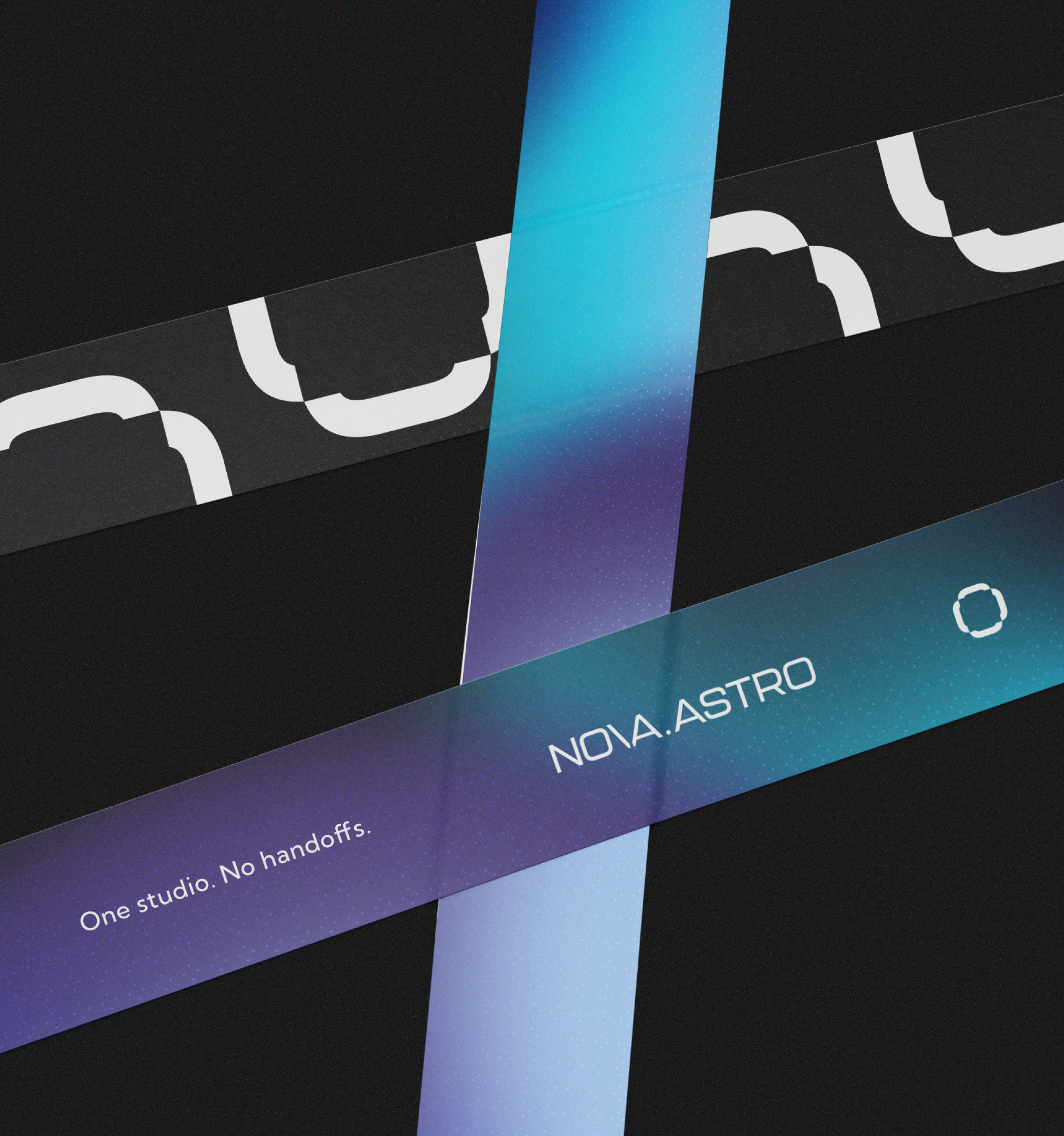
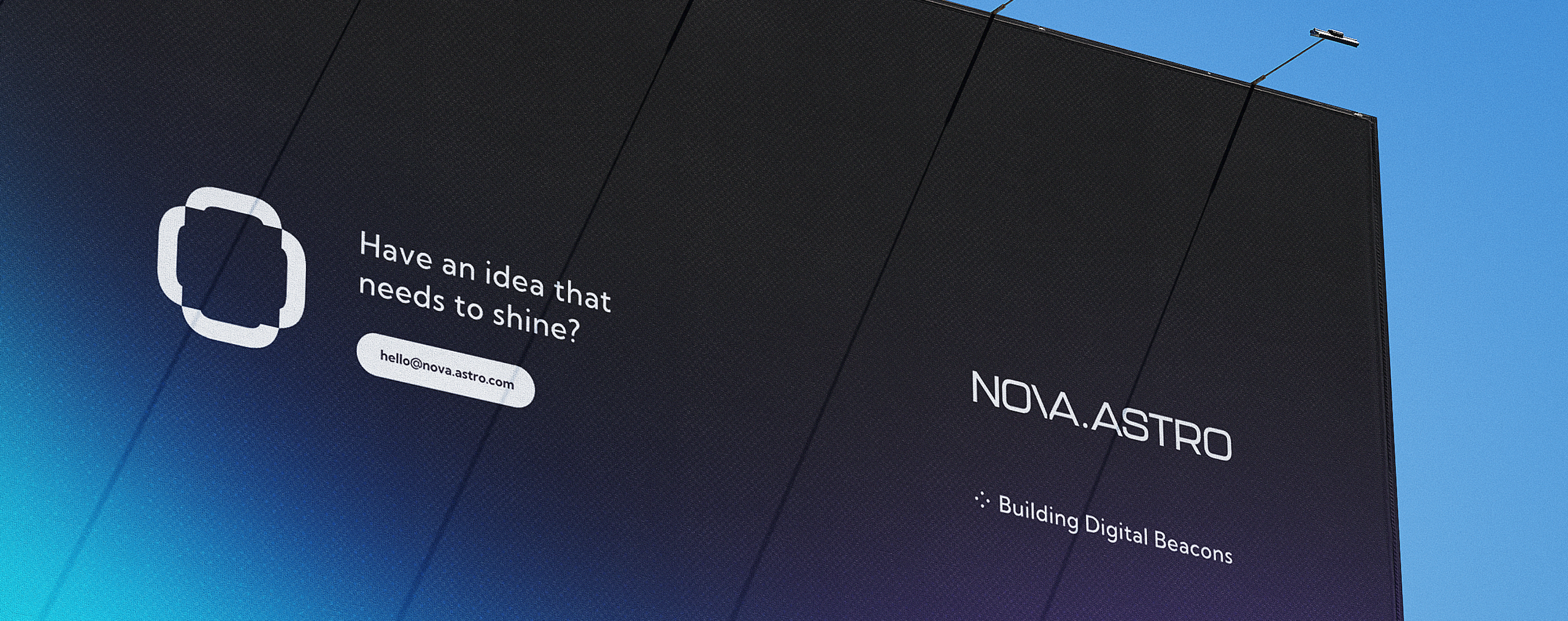

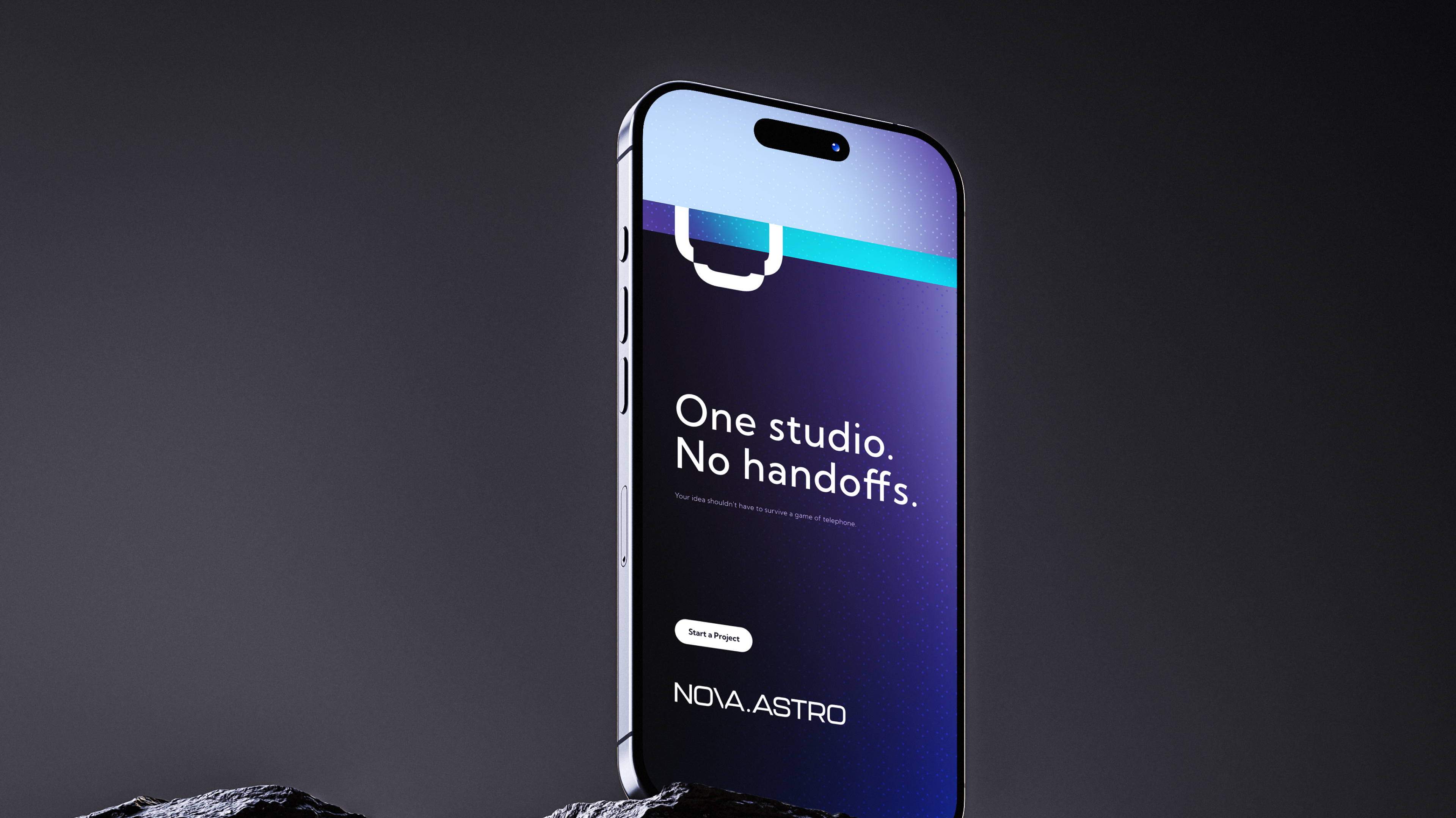
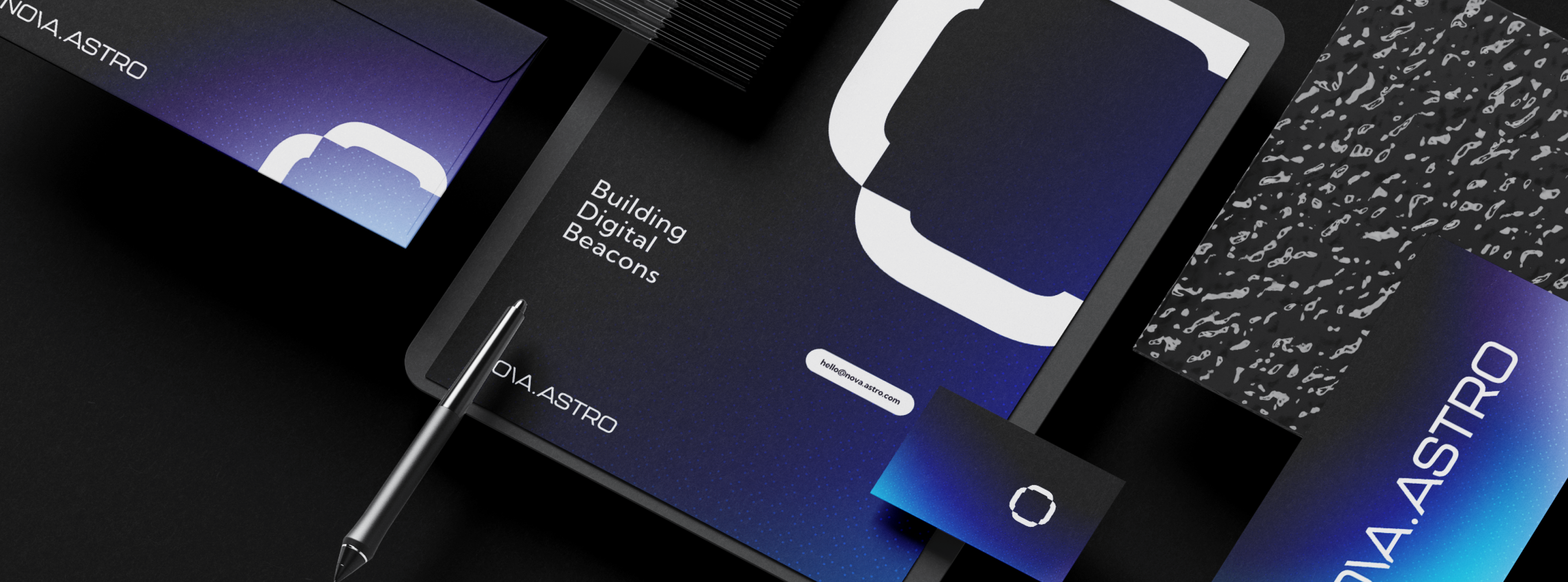


Nova.Astro is a US development company that builds full-stack software. They needed a mark that developers would recognise as their own.
Nova.Astro builds software its clients will rarely look inside. What they do see is the brand, so the brand has to carry the craft for them.
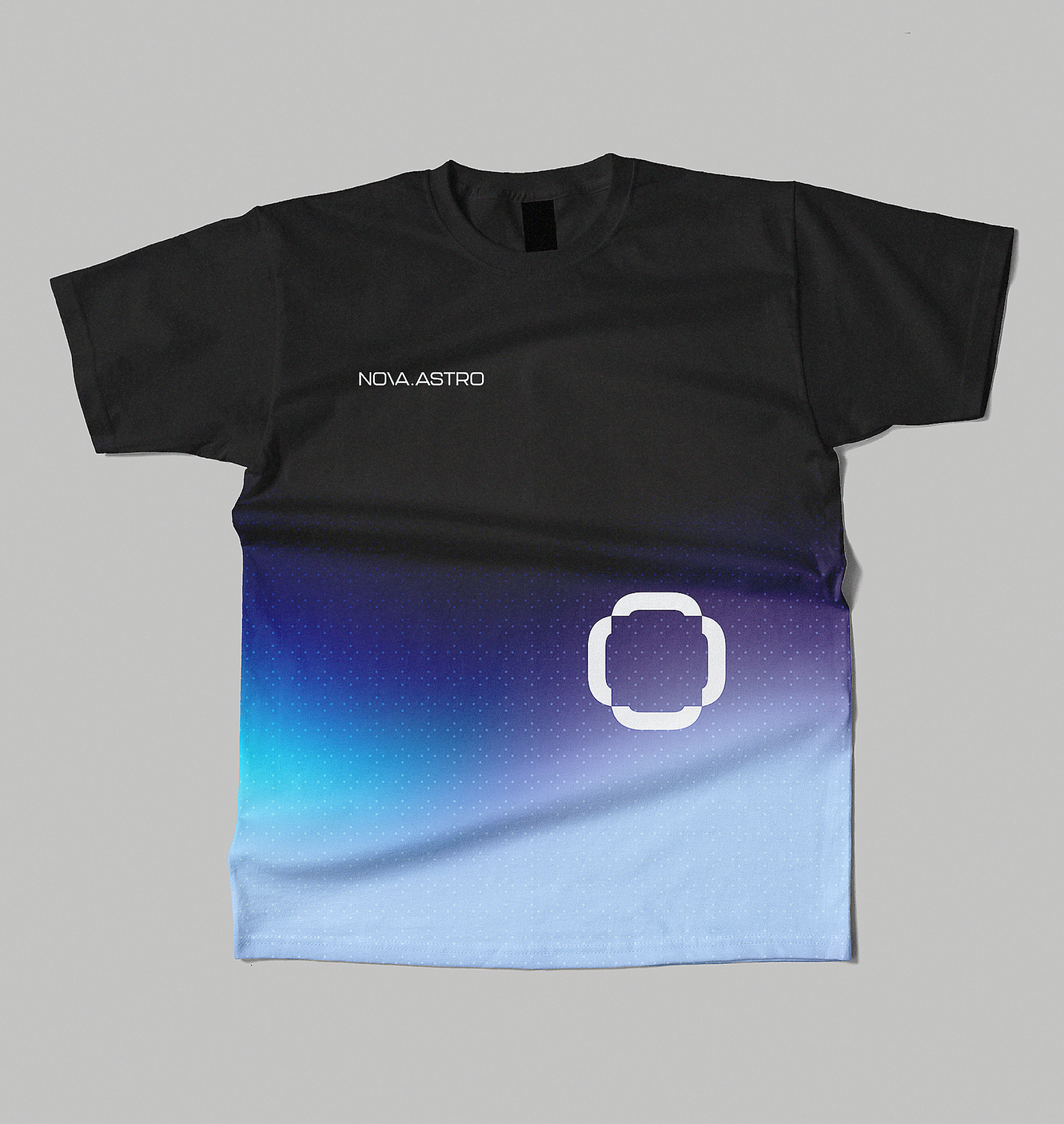
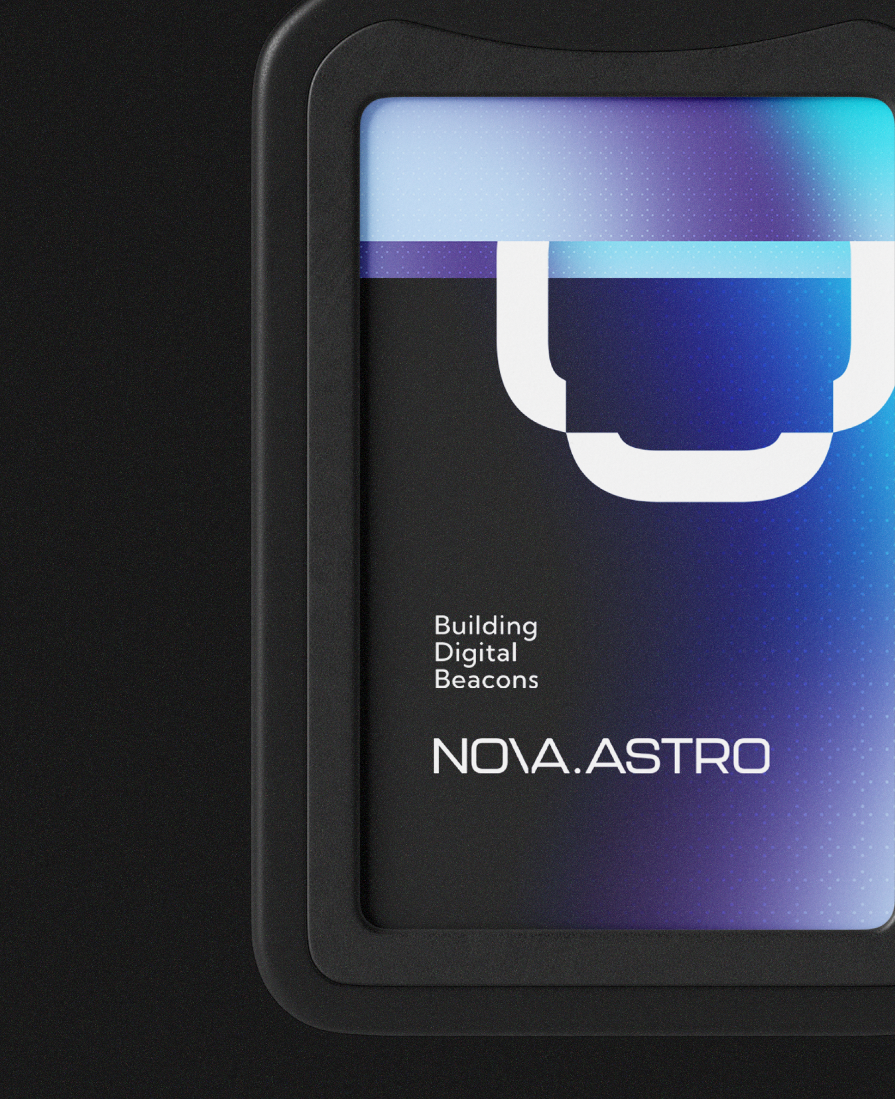
The mark is four code brackets closed into a ring. Read one way it is an orbit, read the other it is code waiting for something to go inside it. The name is set like a domain, NOVA.ASTRO, and the full stop in the middle behaves like a cursor.
Nothing in the motion arrives finished. Each logo is written in front of you: a div is typed, its box draws out of the corner, and the pieces rise on their own layers before they lock together. There are no cuts. The camera moves the whole time, slowing down instead of stopping, the way you scroll through a file you know well.
Behind it all sits a gradient of deep blues and violet under a grid of dots. It is dark enough to read as night sky, and calm enough to leave the logo room.
- Client
- Nova.Astro
- Sector
- Software
- Services
- Brand IdentityVisual IdentityMotion Identity
- Deliverables
- Logo Exploration, 2 RoutesIcon and WordmarkBrand SystemMotion SystemIcon AnimationWordmark RevealStationery and Business CardsBranded Packaging TapeMerchandiseBuilding SignageMobile Applications